Design "Cents": My Two Pennies
Everybody likes free stuff, that's why I thought what better way to kick this blog off than with something free! So here's what I have to offer you, it's some FREE design tips! Hey interior designers aren't cheap (I know, I used to be one)! But please don't think I'm discrediting the work of a designer, they can truly be invaluable. But sometimes you just need a few tricks and tips to help you figure it out on your own and in today's economy nothing beats free!
The tips I'm going to give you are what I would say are the most common mistakes people make when it comes to decorating their homes. If you avoid these few mistakes you will be sittin' pretty...hopefully on your perfect-in-every-way sofa!
Mistake #1
Scale/Proportion: One of the most important things you can do to make a room look right is by filling it with the appropriate size furniture and wall fixtures, unfortunately it's also the most common mistake I see. Too often I walk into a living room only to find that the occupant has crammed a very large sofa into a small room or vice versa a small sofa into a huge room. It's important that when considering any seating units for any space you stop to think about the size of the room and not just the style of the piece. Remember furniture never looks as large as it actually is until it's in your home! If the room has tall ceilings you'll want to consider pieces that have a high back, extending that piece toward the ceiling. You can use art, mirrors, or other wall decor to fill more of the space above as well. A good tip for figuring out if a sofa or chair will fill the space appropriately is to create a stencil of it out of paper. All you have to do is get the width and depth of the piece you're considering then get your hands on some crate paper, cut and paste the paper into the shape of the piece using those measurements then place the paper stencil on the floor where you intend the piece to go. From there you'll also want to take a measuring tape and measure the height of the piece up from the ground. Using this simple tip can save you time and money.
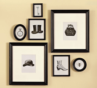
The other most common proportion issue I see happens with wall art. Just because you have something you can hang on the wall does not mean you should hang it. You must take into consideration the size of the piece you're hanging and the space size you are working with on the wall. If you have something small you want to hang on the wall you either need to hang it in a small wall space or consider pairing it with other small pieces to create a larger arrangement on the wall. Another important thing to take into account when hanging wall art is the height at which you hang it. This is a very common error that I see more often then I'd like to admit. When wall art is hung incorrectly it's usually placed too high causing the viewer to look up to take a gander at it. Though there is no way for me to tell you the exact height to hang your pieces at I can give you this general rule of thumb. Unless you are hanging something above a fireplace, tall dresser or headboard, the center of the wall art should be in the general vicinity of eye level for someone who stands about 5'5". When hanging multiple pieces together on the wall another common mistake I come across is the spacing between each piece. For some reason the default is to place the pieces too far apart. When items are placed closer together they appear as a unit rather than multiple smaller pieces.
Mistake #2
Paint Colors: Choosing paint colors is by far one of the most difficult aspects of design mainly because colors change according to the lighting in the room. Throughout the day you may notice the color you've chosen looks pinkish or greenish but these colors seemed absent when you were applying it. Because of these undertones that exist in the paint many people get the paint up and hate it. The best way to avoid this situation is to invest in those $3 sample cans. You need to make sure to paint a generous swatch on each wall, let it dry and then view the paint in the morning, afternoon, and night. This will give you an accurate example of what to expect no matter what time of day it is.
Another important tip to consider when choosing a paint color is the size of the space you are painting. Paint has a way of making a room look smaller or bigger. If you have a small room that you wish to try to make appear larger you will want to choose a light paint color. Dark paint colors will make the walls more prominent making a space feel smaller, this is a great way to make a really large room feel more cozy. Sometimes people like to paint the ceiling of a room, again it is important to take into account the height of the ceiling. If you're ceilings are low, choose a light color to allow the ceiling to feel higher. If your ceilings are very high you can consider a darker color to draw the ceiling down, again making it feel cozy.
Paint is one of the easiest and cheapest way to transform a room. It's a great way to add color and interest with low commitment. Be adventurous with your colors keeping your main pieces like a sofa more neutral. Pillows and bedding are another great way to bring in color and interest with low commitment.
Since I don't have the heart to call people out on their poor design choices I decided that instead I'd show examples of those that have done the above well. Enjoy!


The tips I'm going to give you are what I would say are the most common mistakes people make when it comes to decorating their homes. If you avoid these few mistakes you will be sittin' pretty...hopefully on your perfect-in-every-way sofa!
Mistake #1
Scale/Proportion: One of the most important things you can do to make a room look right is by filling it with the appropriate size furniture and wall fixtures, unfortunately it's also the most common mistake I see. Too often I walk into a living room only to find that the occupant has crammed a very large sofa into a small room or vice versa a small sofa into a huge room. It's important that when considering any seating units for any space you stop to think about the size of the room and not just the style of the piece. Remember furniture never looks as large as it actually is until it's in your home! If the room has tall ceilings you'll want to consider pieces that have a high back, extending that piece toward the ceiling. You can use art, mirrors, or other wall decor to fill more of the space above as well. A good tip for figuring out if a sofa or chair will fill the space appropriately is to create a stencil of it out of paper. All you have to do is get the width and depth of the piece you're considering then get your hands on some crate paper, cut and paste the paper into the shape of the piece using those measurements then place the paper stencil on the floor where you intend the piece to go. From there you'll also want to take a measuring tape and measure the height of the piece up from the ground. Using this simple tip can save you time and money.
The other most common proportion issue I see happens with wall art. Just because you have something you can hang on the wall does not mean you should hang it. You must take into consideration the size of the piece you're hanging and the space size you are working with on the wall. If you have something small you want to hang on the wall you either need to hang it in a small wall space or consider pairing it with other small pieces to create a larger arrangement on the wall. Another important thing to take into account when hanging wall art is the height at which you hang it. This is a very common error that I see more often then I'd like to admit. When wall art is hung incorrectly it's usually placed too high causing the viewer to look up to take a gander at it. Though there is no way for me to tell you the exact height to hang your pieces at I can give you this general rule of thumb. Unless you are hanging something above a fireplace, tall dresser or headboard, the center of the wall art should be in the general vicinity of eye level for someone who stands about 5'5". When hanging multiple pieces together on the wall another common mistake I come across is the spacing between each piece. For some reason the default is to place the pieces too far apart. When items are placed closer together they appear as a unit rather than multiple smaller pieces.
Mistake #2
Paint Colors: Choosing paint colors is by far one of the most difficult aspects of design mainly because colors change according to the lighting in the room. Throughout the day you may notice the color you've chosen looks pinkish or greenish but these colors seemed absent when you were applying it. Because of these undertones that exist in the paint many people get the paint up and hate it. The best way to avoid this situation is to invest in those $3 sample cans. You need to make sure to paint a generous swatch on each wall, let it dry and then view the paint in the morning, afternoon, and night. This will give you an accurate example of what to expect no matter what time of day it is.
Another important tip to consider when choosing a paint color is the size of the space you are painting. Paint has a way of making a room look smaller or bigger. If you have a small room that you wish to try to make appear larger you will want to choose a light paint color. Dark paint colors will make the walls more prominent making a space feel smaller, this is a great way to make a really large room feel more cozy. Sometimes people like to paint the ceiling of a room, again it is important to take into account the height of the ceiling. If you're ceilings are low, choose a light color to allow the ceiling to feel higher. If your ceilings are very high you can consider a darker color to draw the ceiling down, again making it feel cozy.
Paint is one of the easiest and cheapest way to transform a room. It's a great way to add color and interest with low commitment. Be adventurous with your colors keeping your main pieces like a sofa more neutral. Pillows and bedding are another great way to bring in color and interest with low commitment.
Since I don't have the heart to call people out on their poor design choices I decided that instead I'd show examples of those that have done the above well. Enjoy!

This is a great example of how to cluster smaller pieces to create a larger unified piece.
The use of color on the wall is adventurous and appropriate for this size room, the scale of the sofa is right, the wall art cluster creates a unified whole, and accent pillows provide interest and are adventurous.

This is my babies room.
The light wall color draws attention away from the small room making it look larger and allows the crib to be the focal point.

The white paint makes this small space appear larger. The boxes hung on the wall are at the perfect height and distance apart.

The dark paint color makes walls more prominent creating a cozy feeling in the room. The light ceilings make the room appear bigger. The scale of the furniture is just right.


Comments
Post a Comment